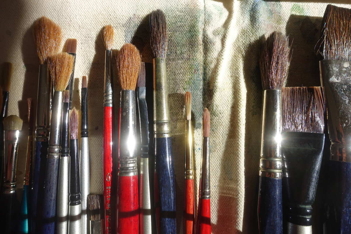
My favorite brushes for a while have been sable/synthetic mixtures from Daniel Smith, a Seattle-based art supply house best known for its paints. The brushes are less floppy than the all-sable brushes I’ve used, yet are easy to point up, even the jumbo #30 round, and they hold a lot of paint and water. Such brushes also cost a lot less than all-sable brushes. One of my favorite sizes is the #20 round—about a half inch in diameter at the ferrule, big and fat and good for painting large areas or with big gestures. A #20 blend costs around $50. Top of the line sable—$450.
Sadly, Daniel Smith is now selling only its paint by mail. I emailed the company to find out what brushes might be comparable. It turns out that Daniel Smith had been getting its brushes from DaVinci, which, despite the name, is a German company making brushes in Nuremberg since the 1950s. As it happens, I’ve bought some DaVinci brushes over the years, including two of my favorite travel brushes.
A painter buying new brushes is like a writer sharpening the pencils or hunting for the perfect pen—an act of hope and also of stalling. There’s always the chance that a new tool will lead to a breakthrough. And it’s fun to contemplate the choices. Watercolor brushes come in myriad sizes, from a few hairs to a fistful. Shapes include rounds and flats, mops and filberts (flat but pointed), and fans, liners, and riggers (long and flexible). The handles, usually wood but sometimes plastic, can be long or short or collapsible in various ways to make the brushes easier to carry. The pointed end can be a painting tool too. Natural bristles come from various creatures—squirrels, oxen, goats, ponies, hogs, even badgers, each with its own stiffness and shape and paint-holding abilities, with the finest being Kolinsky sable—not the fur animal but a relative, the Siberian weasel, Mustela sibirica. Synthetic bristles vary in how well they mimic the water-holding and paint-delivering capabilities of natural ones.
(Oil painting and specialties like retouching, gilding, and sign painting require even more types, such as the mottler, short and stubby; the fitch pounce, round and fluffy: the dagger striper, a long flat brush whose bristles are in the shape of, well, a dagger.)
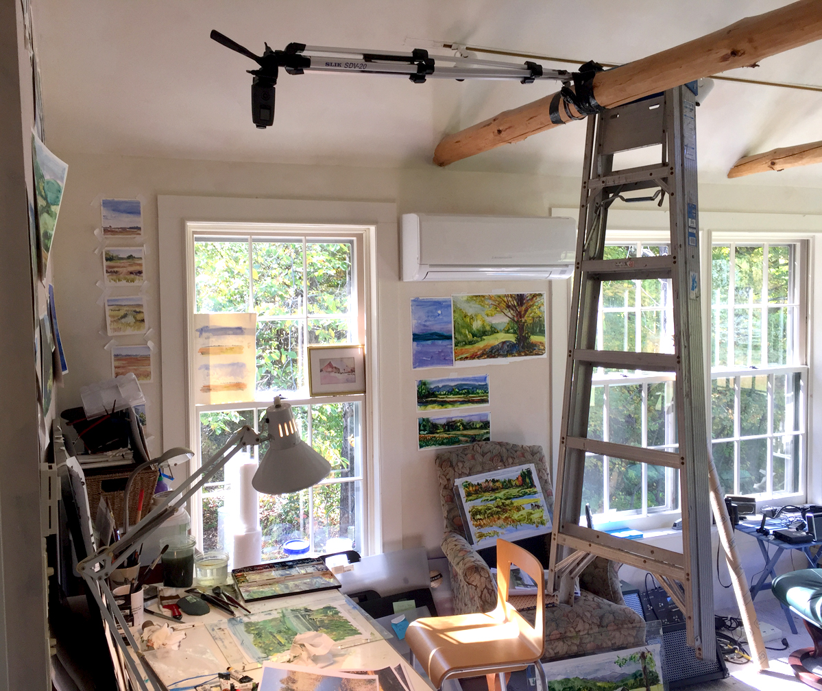
I carry my working brushes in a canvas roll that holds maybe 30, more if I double up the smaller ones. (I also have a couple of handfuls of “retired” brushes standing on end in jars by my painting table.) When I set up to paint, I take out the five or six that are my current favorites—#12 and #20 rounds, a big soft flat for washes and some smaller, sharper synthetic flats for painting grasses and edges and lifting in straight lines. A #6 round is about as small as I go. Oh, and lately I’ve been experimenting with a three-inch house-painting brush to smooth out washes on the Yupo synthetic paper I paint on.
Here’s a good goal for the tool: “I'll dip my brush into the sunrise, and the sunset, and the rainbow.” —Robert Browning to Elizabeth Barrett in The Barretts of Wimpole Street.